IMAGES IN ACTION
Rory’s work in real-world settings.
COLLABORATIONS WITH DP ARCHITECTS
Working with a client over several years is like being part of a family.
You get to know their likes and dislikes, their specific needs, and their vision.
You grow fond of the company and the people in it.
You see them evolve, you see your images used to grow their business, and you become a part of their fabric.
I have been blessed with working with the team at DP Architects since 2011. We’re now at a point where I know their style, I know what works for them.
I know how they use their images, and how they want to portray themselves to their clients.
Here’s a collection of images we have made together, as partners.
PORTRAIT OF THE SINGAPORE PM FOR THE BBC
I promised to not talk about this project, so I am not quite sure what I am allowed to say!
Let’s just say I proudly took this portrait for the BBC….and just leave it at that! Ha!!!
THE STUDY
The Study had a bit of a revamp recently, so I was brought in to update their imagery to reflect their new image.
The brief was to create feelings of a warm and welcoming British gastro-pub.
The non-pretentious but carefully staged food shots and portraits seem to capture the essence of the restaurant’s brand.
CONGRATULATIONS TO MUFJ ON THEIR NEW DIGS
The Bank of Tokyo-Mitsubishi UFJ, Ltd celebrated a move to the landmark Marina One Building with a full-page ad in the Business Times.
My brief was to make their building prominent, with a good view of their signage.
It was a challenge to isolate the building from the surrounding buildings, but I think we achieved the goal of presenting the building in its best light. The trees were a bonus – they softened the image, and I think they give it a Japanese feel, reflecting the heritage of the bank nicely.
AN OLD FAVOURITE
Alan Johns is someone I admire and respect greatly, so it is an honor to see one of my shots on his office wall. He talks a little about it on his blog.
This is one of my all-time favourite images. I love it because it is filled with joy and freedom, taken at the epicenter of where I am happiest – Ladakh, in the Indian Himalayas.
Here’s a screen grab from his blog:
DID I MENTION I LOVE PANORAMAS?
Yeah, I have probably mentioned this before! But I do! Panoramas, done well, can tell bigger stories.
In this case, viewers can see that Ce La Vi at Marina Bay Sands has a restaurant, a bar, and a view.
Three for the price of one in this advertisement for Marina Bay Sands, Singapore!
I’M ON THE TELLY!
I was a judge on The History Channel recently.
The show is Photo Face-Off where a professional photographer competes with amateur photographers to win the final showdown.
Thankfully I didn’t have to compete, so the pressure was off!
IT’S OKAY TO ASK
Commercial photography is a very collaborative process. It’s not just one person directing everything to their own taste.
Which is why I love to get get everyone involved in my shoots.
I want to know my client’s vision. I want to know the feelings they want to portray, what the image should say about their brand. What they want to sell.
On a recent shoot atop the Marine Bay Sands at Ce La Vi, I started with my usual style of a fairly conservative portrait.
I love to go a bit crazy with my portraits, but I understand local tastes, and try to cater for them.
But the team at the bar had other ideas – they wanted something a little moodier, something a little edgier.
And they weren’t afraid to ask me to change direction.
This is the image we created once we all understood the mood they were after. I think we created something special.
It’s just the right mix of being out there, but still with the right corporate tone and an air of sophistication.
So I encourage my clients to be a part of the process. Share your thoughts, tell me about your vision –
my job is to listen and adjust to your needs while at the same time contributing my insight as well.
The sign of a true collaboration is when everyone adds their own piece of expertise to the process. And it always produces better results!
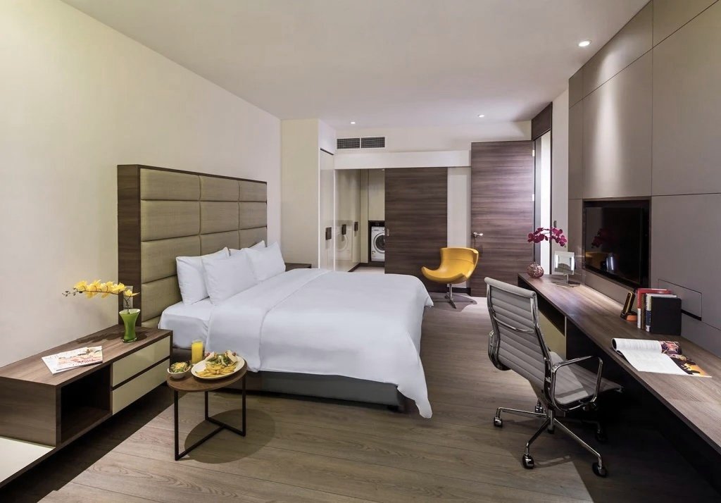
Okay, I know how it looks – Rory is slacking off again! But it’s not true!
This is how we make hotel beds look pristine and perfect. I know it a little bit cheaty,
but I pull the sheets tight to remove any visible creases and slot this bit of the image into the final image.
This is one of the newly renovated rooms at M Hotel, Singapore.
Update! The final image:
I knew I got ‘the shot’ when I captured this restaurant image for Pollen at Garden’s by the Bay.
I knew this one put the restaurant in context, I knew it was bold and eye catching. I knew it would intrigue the viewer.
The restaurant marketing department obviously agreed because it is the opening image on their website –
the image that grabs the viewer’s attention and entices them to explore more.
Which is really what I try to achieve with every image I make. In my mind, every exposure has to be a winner.
None of them can be boring, humdrum or just average. They have to tell my client’s story while trying to sell an idea, help people discover and excite the senses.
Another of my shots appears on their Facebook over – another example of my panoramas fitting in nicely with FB’s cover image ratio….
FREE PUBLICITY
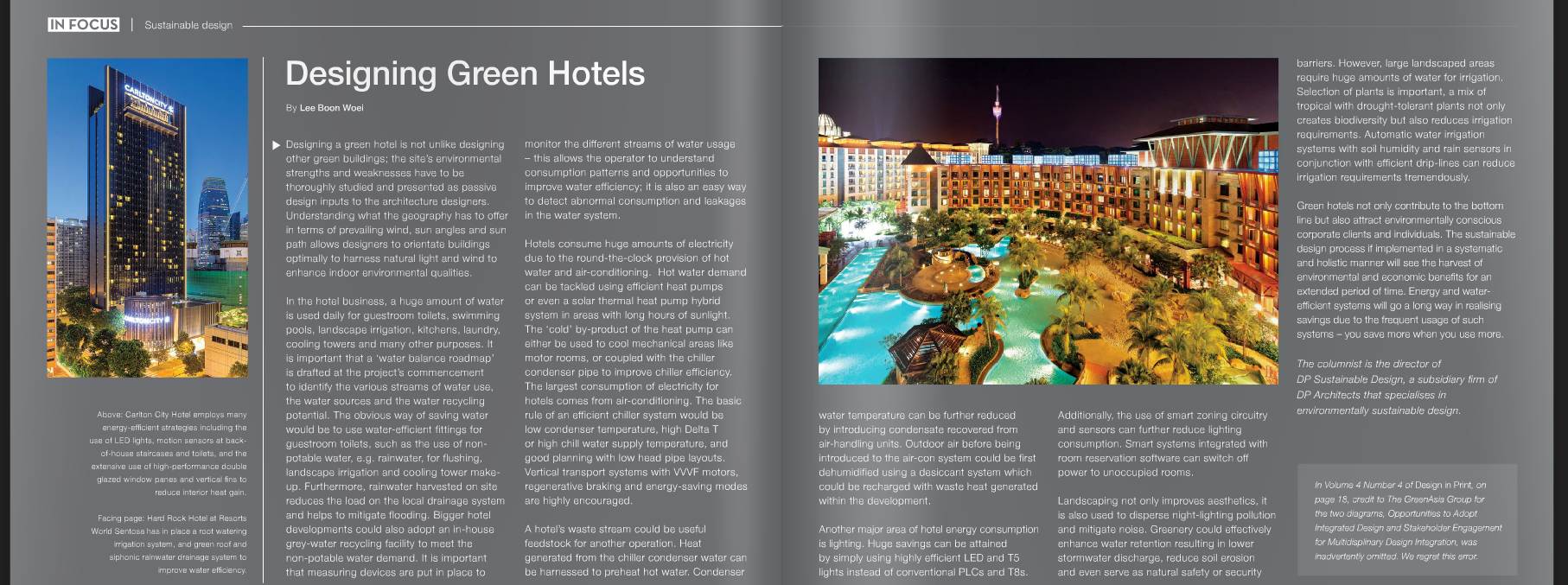
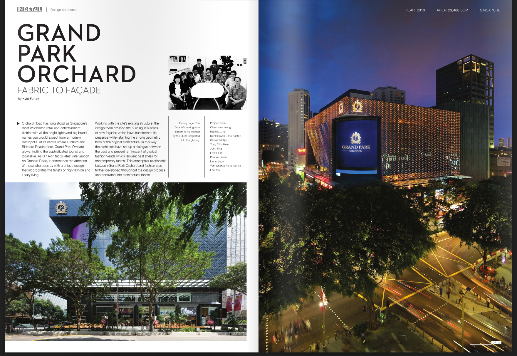
DP Architects recently got a little bit of free, yet valuable publicity for a building they designed – the amazing Singapore Sports Hub.
Because the Straits Times newspaper used an image DPA supplied rather than use images from their own photojournalists,
the architects got priceless publicity for free with a nice big double page spread, with their name shown prominently.
There could be a hundred reasons why they went with this image, but I like to think this was because supplied image they
supplied was compelling, eye catching, and was the right image for the article.
You can see more shots I took for this project at this link here.
RESTAURANT ANDRÉ & FOUR MAGAZINE
One of the best things about my job is meeting and working closely with people who are at the top of their game.
Working with André Chiang of Restaurant André is a bit like working with a slightly mad genius…but in a good way.
His food and restaurant always fills me with a sense of whimsy, providing an escape from the real world for a few hours.
Here’s the result of me escaping reality for an afternoon, collaborating with a true artist and possibly genius….for Four Magazine.
FEATURED BY HIRSCH BEDNER ASSOCIATES
I am honoured to have my images of Shanghai’s beautiful Peace Hotel featured on the Hirsch Bedner Associates website.
The renowned architects are the world’s number one hospitality design firm.
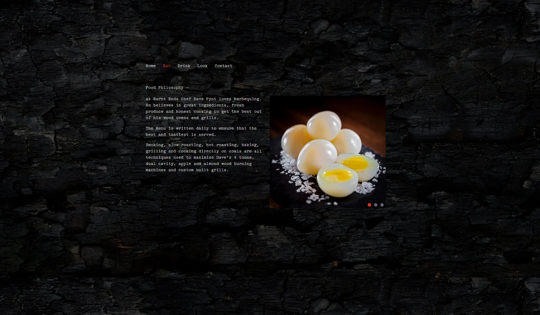
BURNT ENDS
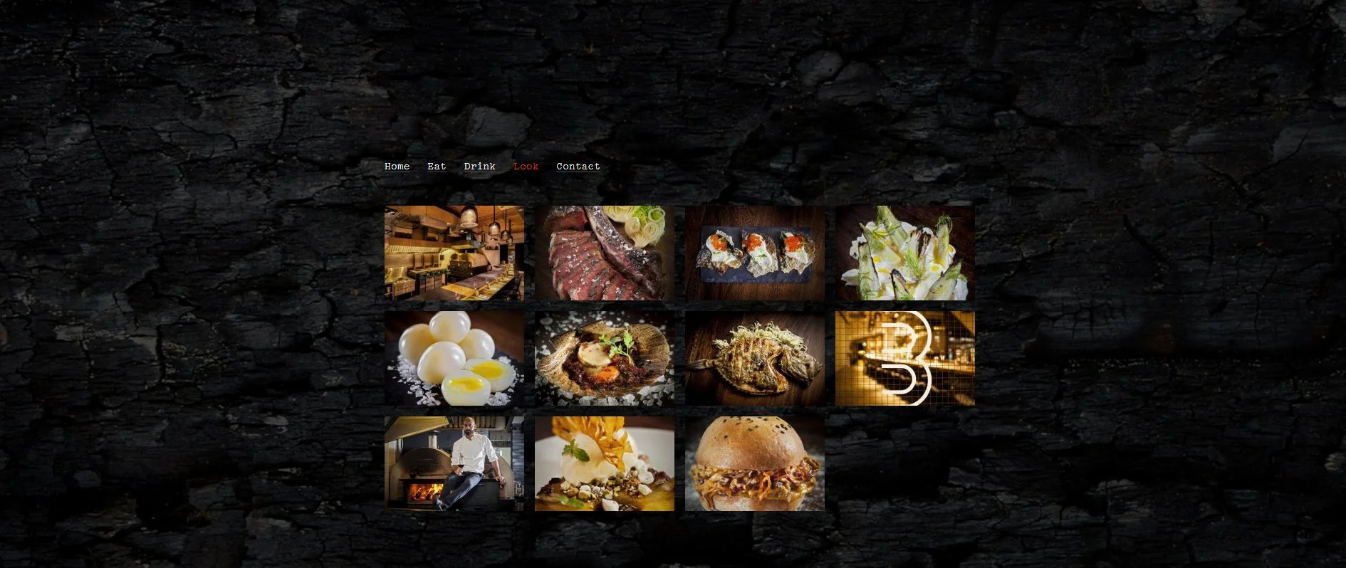
What I love about the Burnt Ends project and the resulting website is that everything is consistent and on-brand.
The food drives the brand which informs the interior. And the photography brought all these aspects together in one cohesive message.
FOUR HOTELS ON ONE PAGE!
This has to be a bit of a record! Elle Travel this month printed a page with seven images I shot for literally four different hotels!!
Sure, three of them are part of the same stable – Wanderlust, 1929, and The New Majestic,
but my picture of the Singapore Sling for Raffles Hotel rounded out the quadrella!!
Now all I have to do is convince the Westin to use me for their hotel shots!! How about it Westin!!!!?
PANORAMAS MAKE AWESOME FACEBOOK COVER PICTURES!
Nice to see Gardens By The Bay going through their archives and still using a panorama I took for them two years ago!!
Great to know that some of my images are timeless, and can be used well into the future.
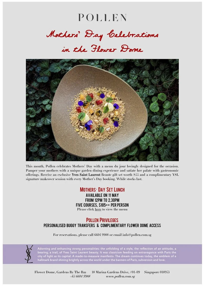
MOTHER’S DAY AT POLLEN.
If my mum was in Singapore, I’d definitely be treating her to lunch at Pollen!!
If, like me, you can’t manage to take you mum there, may be you can just make-do with drooling over this picture?
I spent the afternoon climbing around their garden, finding just the right place to place their latest dishes.
Given the restaurant is a garden within a garden, it seems only natural to shoot their food this way….
WHAT ARE YOU?
Are you a rainmaker, hipster, explorer or a lover?
I like to think I am all four at one moment or another.
Which is why Big Hotel is my first choice of hotel in Singapore.
Actually, that’s not true – I live here, and snuggle in my own bed!!
However, I am a huge fan of the Big Hotel website. It customizes the experience for the visitor, and gives them information designed just for them.
I really enjoyed working with the agency and the hotel management on this to get the branding and the feeling just right,
and to make images that would work well on their website.
I think we succeeded. There is a consistency of style and colour that makes it work.
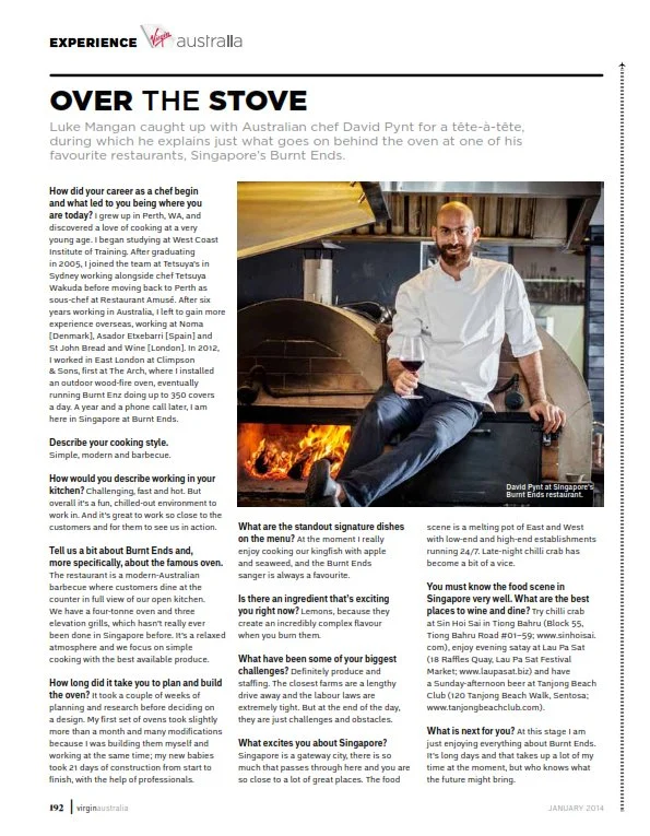
BURNT ENDS
Dave from Burnt Ends is a good guy.
We spent the afternoon shooting his food.
We laughed, we told tall tales and reminisced about our home country and living in London.
It was a good job – we were both on the same page – my photographic style and his food were meant for each other.
This was a while ago, but I was reminded of our shoot on a flight recently when his face was peering back at me from the Virgin Blue inflight magazine –
just as he did months ago when we made this picture together.
BRUNCH AT KEONG SAIK STREET SNACKS
Chef Andy at Keong Street Snacks dazzled me again with his latest brunch menu…..
The brief was to make the food rustic and accessible.
We didn’t want the food to look too dressed, but it still had to have ‘feeling’.
This is, incidentally, what I can shoot in half-a-day. Eleven shots between 9:30 am and 12:30 pm.
It also helps if the food is plated as amazingly as this was….
Case Study
HILTON HOTEL - SINGAPORE
This case study covers one full-day job in the hospitality industry, as an example of what can be done in 8 hours.
Client: Hilton Hotel - Orchard Road, Singapore
Duration: One day (8 hours)
Subject: Food photography, portraits, and restaurant shots.
I have worked with the marketing team at Hilton Hotel Singapore for many years. They have several outlets, each with very distinctive personalities and carefully identified market segments. I have worked closely with Cindy and Stephanie to understand each brand, and develop ways to sell their brand visually. I see myself as an integral part of the marketing team - just one who visits the office every three months.
I have shot their rooms, meeting spaces, lobby, pool, and various restaurants, as well as the seasonal updates of food shots, and updating their staff portraits.
This was a full-day job, with a shoot sheet with precise timings, and mood boards. We had worked together as a team on these outlets before, having already established the visual language, so this job was about being loyal to that vision while still playing with, and extending the message a little.
We set aside an hour for the four Il Cielo Restaurant food photography because Chef Sasaki and his team plates the complicated dishes fast on a simple white acrylic board - and because we know exactly how we want to light the dishes.
Il Cielo
Chef: Yohhei Sasaki
It’s always a dream working with Chef Sasaki. He is fast, yet precise. Exacting, yet creative. I like to think I have those qualities too, so we get along. And I think the images reflect this.
The rest of the day was set aside for the Opus Bar & Grill shots. The images a more technically complicated and meticulous with a lot of moving parts, including ‘models’.
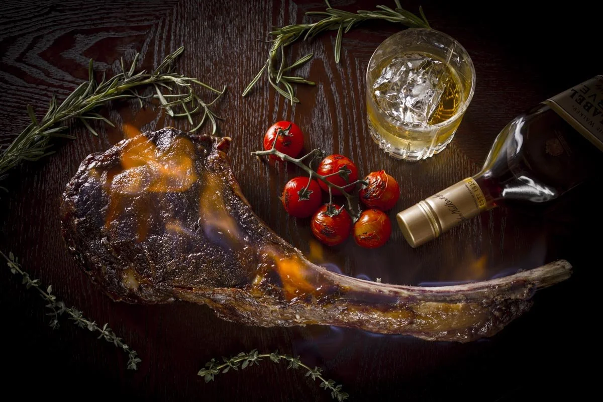
Opus Bar & Grill
This image is about pairing whisky and steak for a promotion.
Getting the flames from the whiskey-infused steak to show up in a photo was tricky and required lots of problem solving.
While Il Cielo has a light and fresh visual language, Opus has a dark and contrasty look that we developed together when the outlet first opened. The two outlets are shot very differently too. Il Cielo’s food is photographed the way it is served, while Opus is more conceptual and driven more by feeling. Each image is crafted from an idea - for a very specific purpose or promotion and not always a menu update.
We shot some textural images that showed the dining experience, bringing humans into the picture.
Finally, we made some drink shots.
We made 19 unique images over the day. Some with a number of variations for the client to choose from bring the total image count to 27. While we only shot two outlets on the day, this case study illustrates how each outlet is consciously shot in a way that captures the essence and personality of each brand - all within the client’s branding guidelines and local marketing specifications.
These are the images we made in one full day (8 hours):
Case Study 1: Nanyang Techological University
Client: Nanyang Technological University - Singapore.
Duration: Half-day shoot - 4 hours.
Subjects: Architecture and a corporate headshot.
The marketing department at Nanyang Technological University, Singapore gave me the unique challenge of photographing their architecture on the same day as shooting one of their newly appointed executives.
Because I am experienced in working with both people and buildings, I happily took up the challenge. The brief was to shoot the headshot in a studio setting, and a less formal campus setting with one of their new buildings in the background, then photograph their newly built buildings, and be done by within four hours. They didn’t want deep photographic studies of the buildings, instead, they wanted an overview of their newly completed structures for marketing purposes. This case study is a good example of what can be shot in four hours.
Consistency
The studio portrait needed to match their other portraits with a white background.
It was shot in one of their meeting rooms, using portable studio lights.
Note the light on the side of his face, and the subtle shadows that contour his face.
The client engaged their own make-up artist for the shoot.
OUTDOOR PORTRAIT
I prefer to shoot less formal poses, but this pose is consistent with the University’s brand.
The indoor and outdoor took an hour, freeing up the subject quickly.
With the portrait done, we focused on the new campus buildings that had yet to be documented.
The Arc
NTU Campus
Architect: Kirk
NTU Sports Hall
“The Wave”
Architects: Toyo Ito
VOLUME
The main aim of this image was to emphasise the huge volume of the hall, and to accentuate the curves extending into the interior.
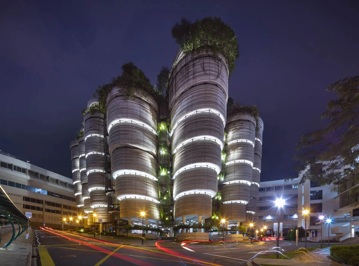
The Hive
Despite being one of Singapore’s most photographed buildings, the University hadn’t yet documented this much-loved building.
Architect: Thomas Heatherwick
The gallery below shows all of the images the client received from the half-day shoot:
Case Study:
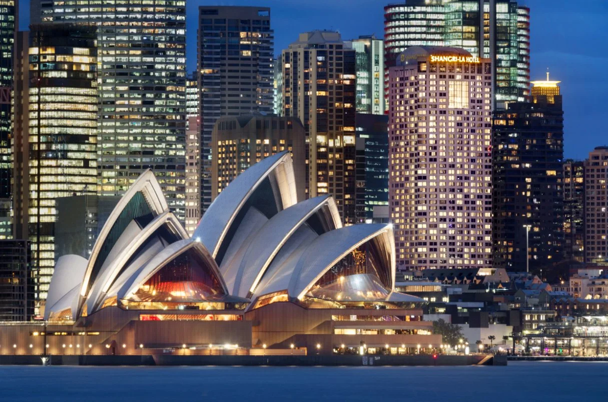
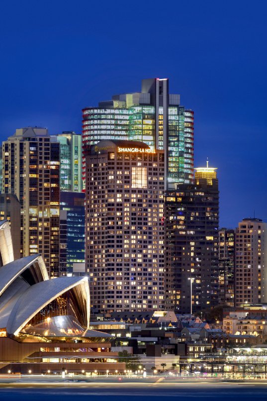
Shangri-la Hotels and Resorts
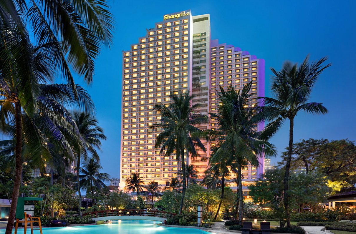
Category: Hotel Architecture Photography.
Client: Shangri-La Hotels and Resorts
Agency: VRX Studios, Canada.
Duration: Average of three days per hotel over several weeks.
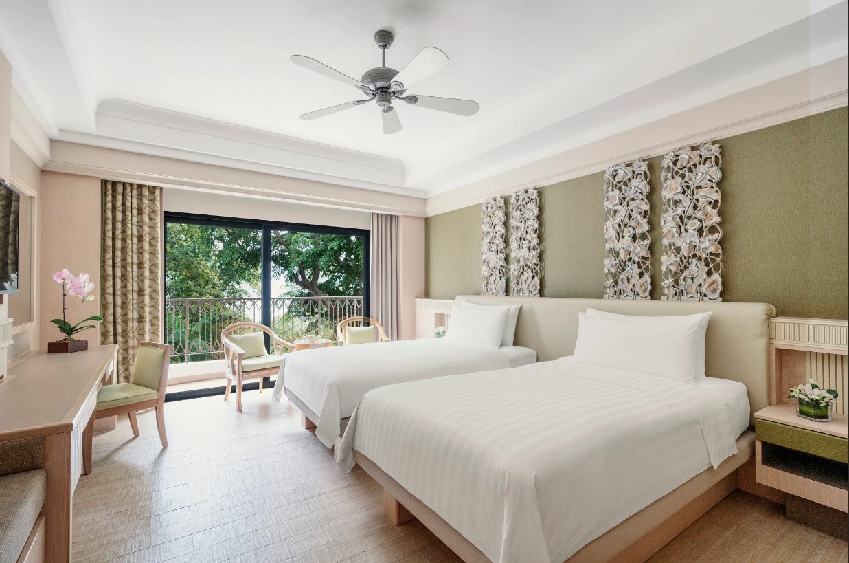
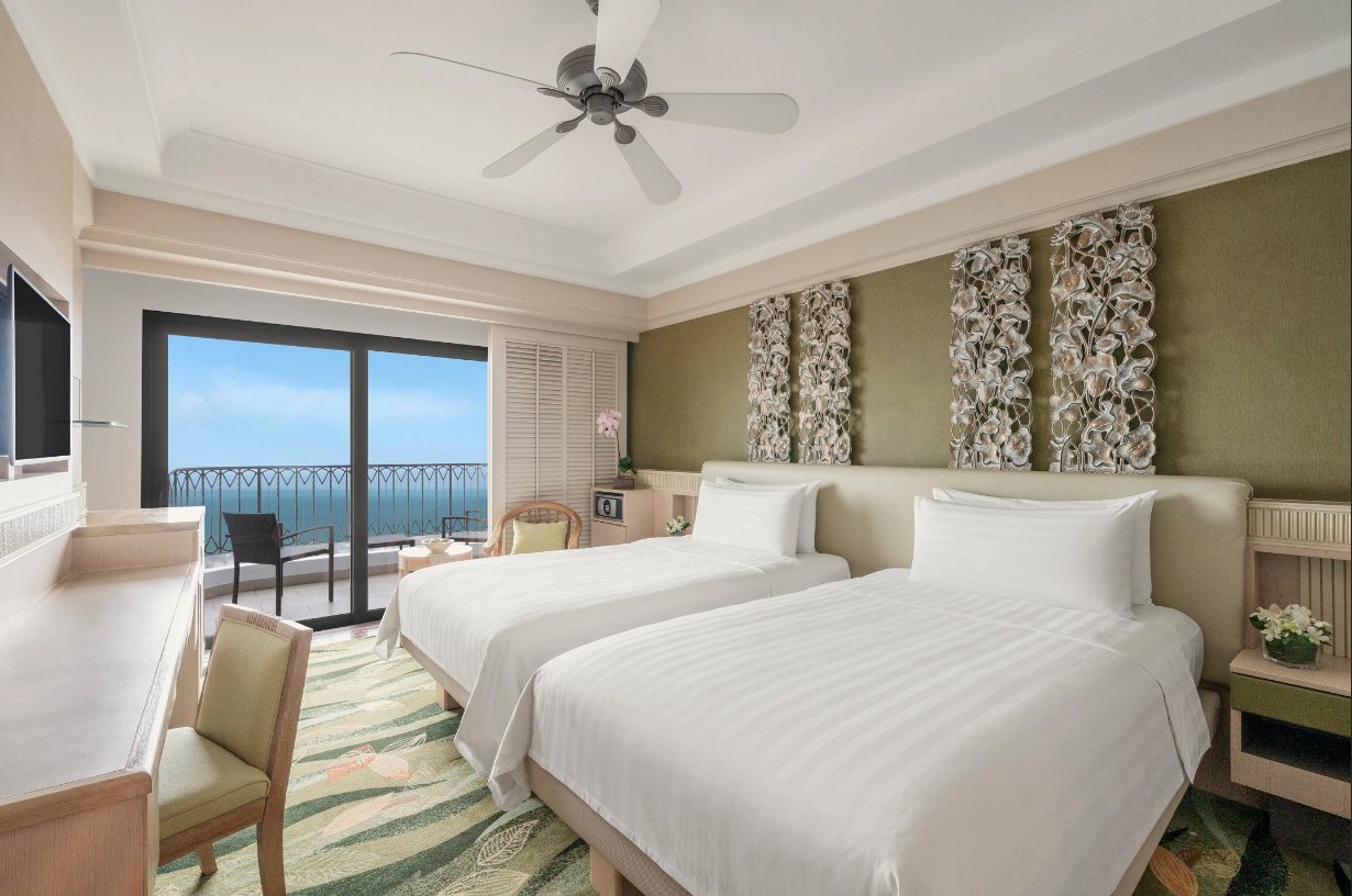
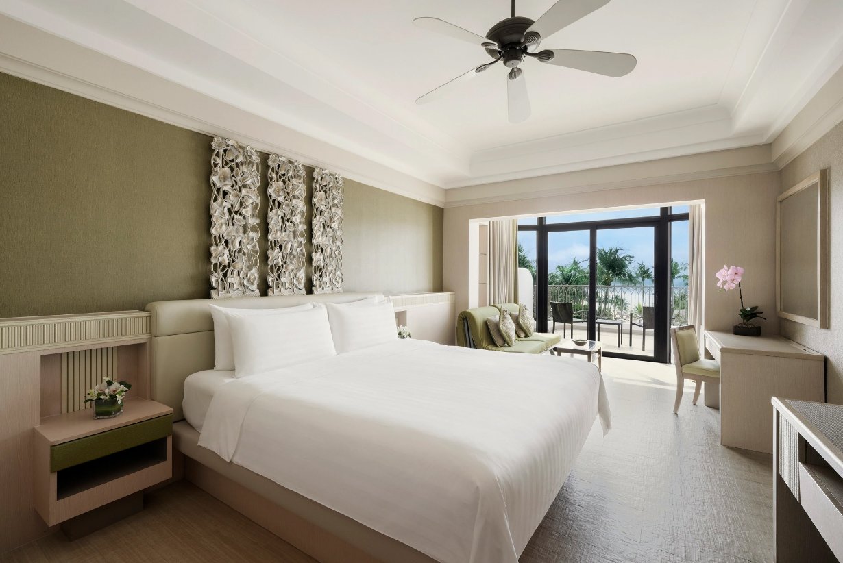
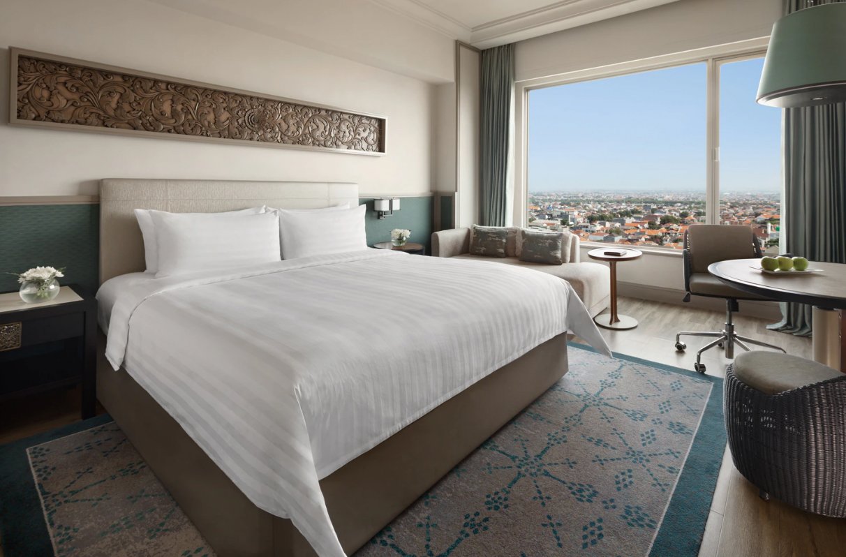
Overview: A re-vamp of architectural images for 11 hotels in Asia and Australia
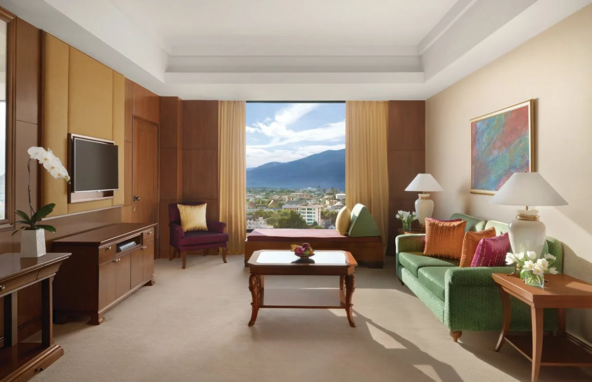
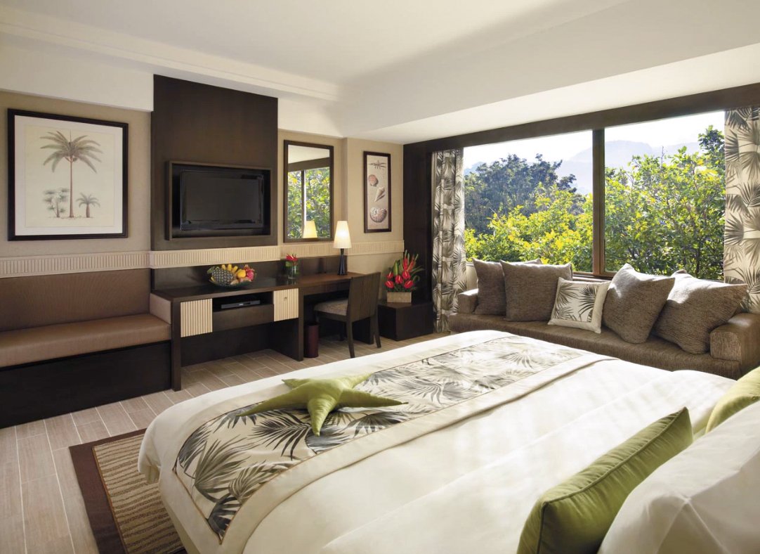
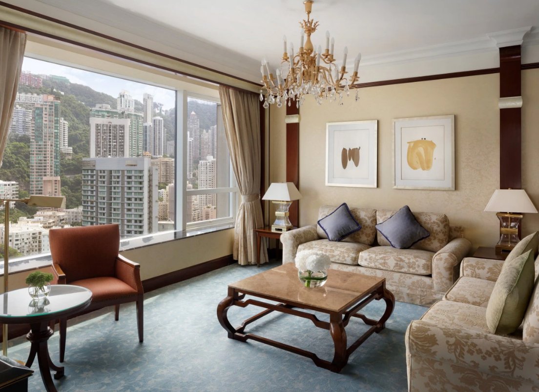
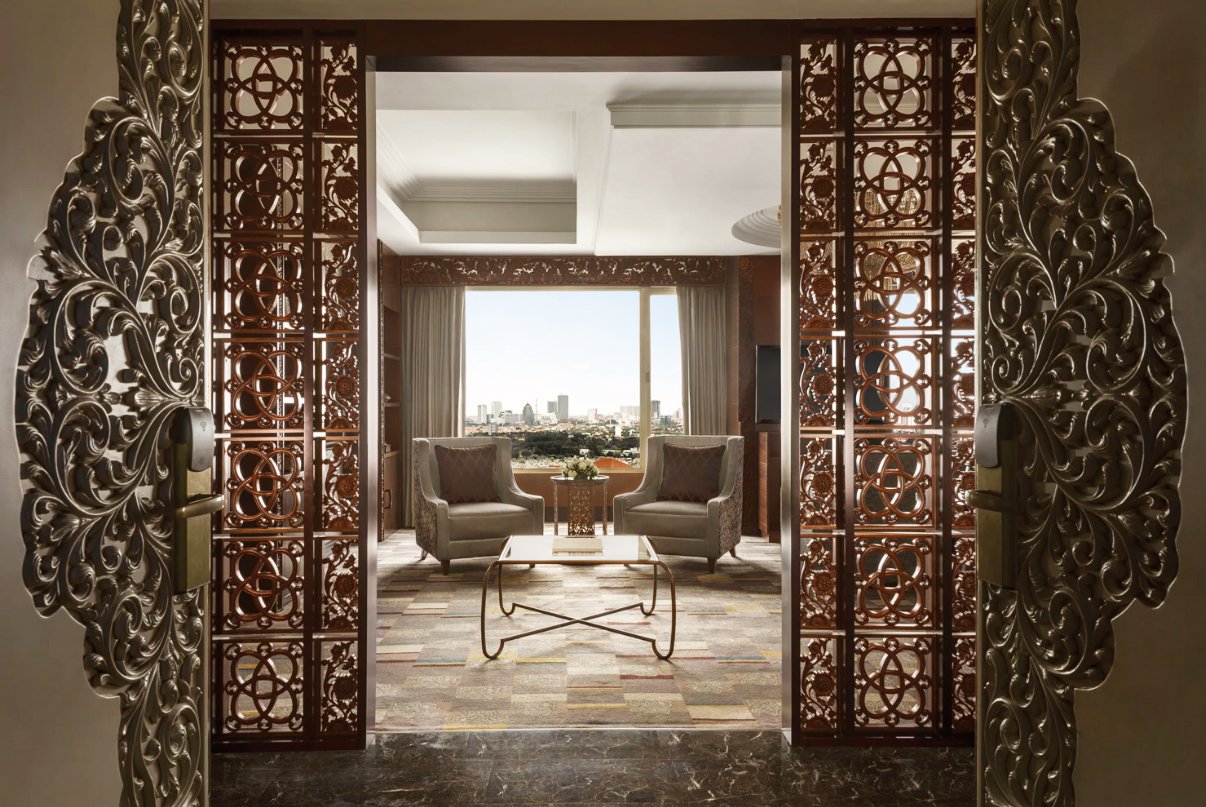
Hotels Photographed: Shangri-La Sydney, Island Shangri-La Hong Kong, Shangri-La Bangkok, Shangri-La Chiang Mai, Shangri-La Kuala Lumpur, Shangri-La Golden Sands Penang, Shangri-la Rasa Sayang Penang, Shangri-La Yangon, Shangri-La Jakarta, Shangri-La Surabaya, and Shangri-La Rasa Sentosa Singapore
11 Hotels in 7 Countries
A major re-vamp of the hotel’s visual language.
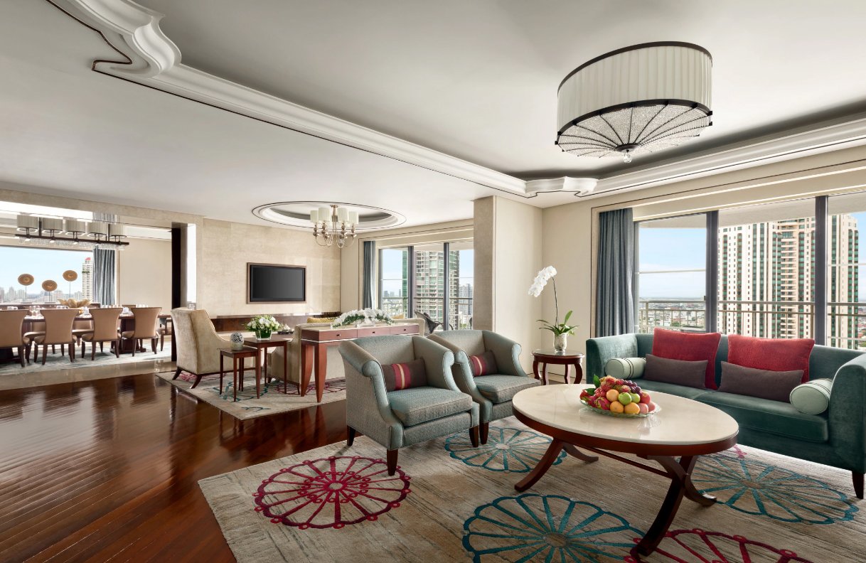
Evolution is a fact of life in the hospitality industry. Hotels work in an ever-changing cycle of adapting their image, target audiences, vision., positioning and visual language. I was a part of this evolution as Shangri-la Hotels and Resorts management implemented major changes to how they presented their room and hotel facilities to the world.
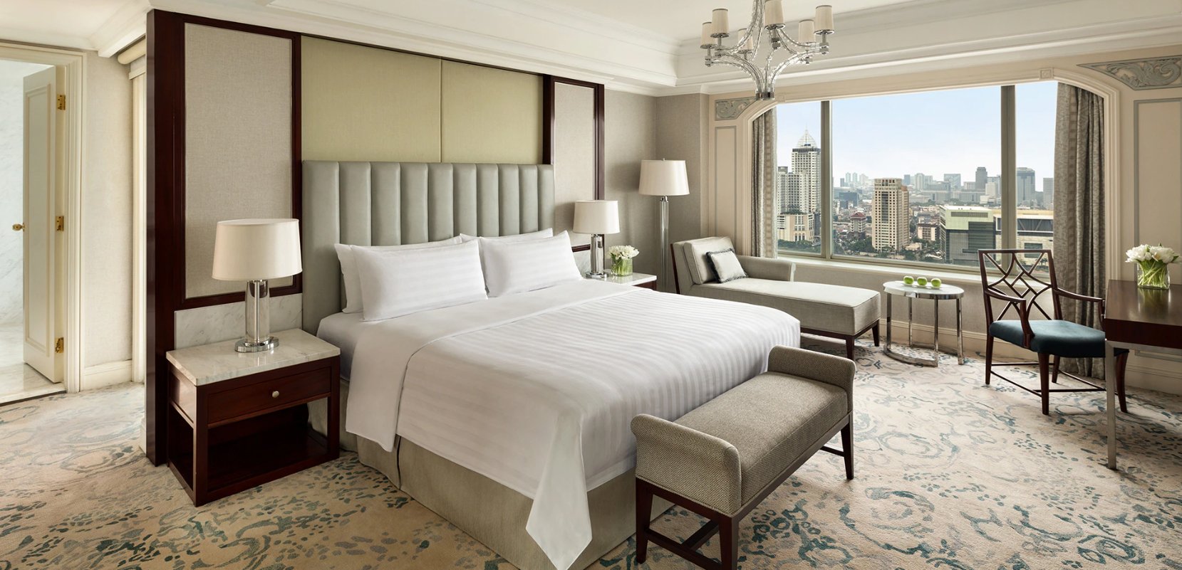
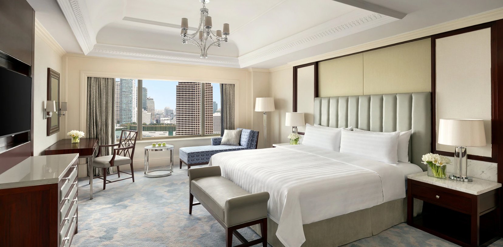
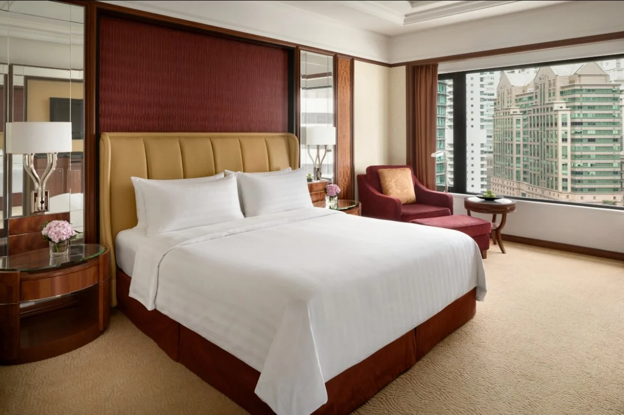
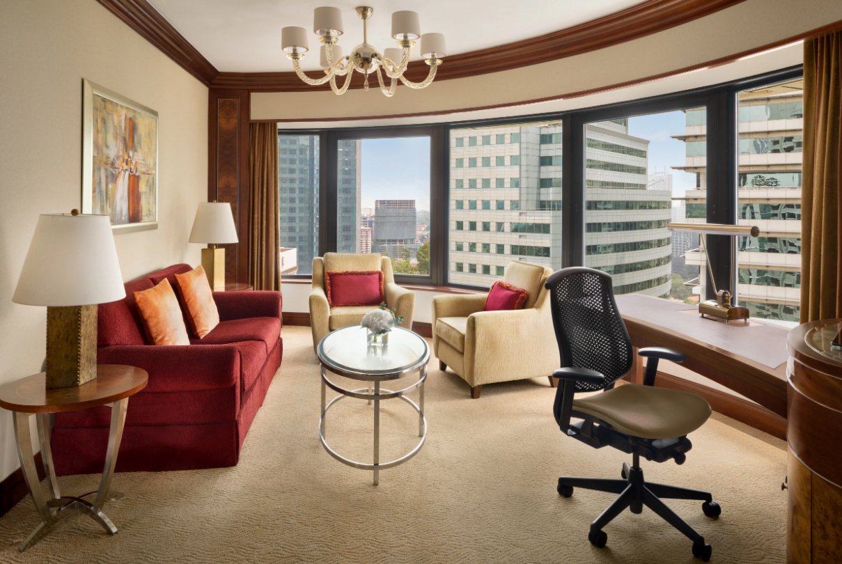
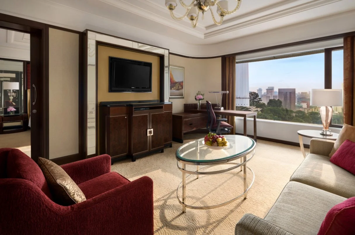
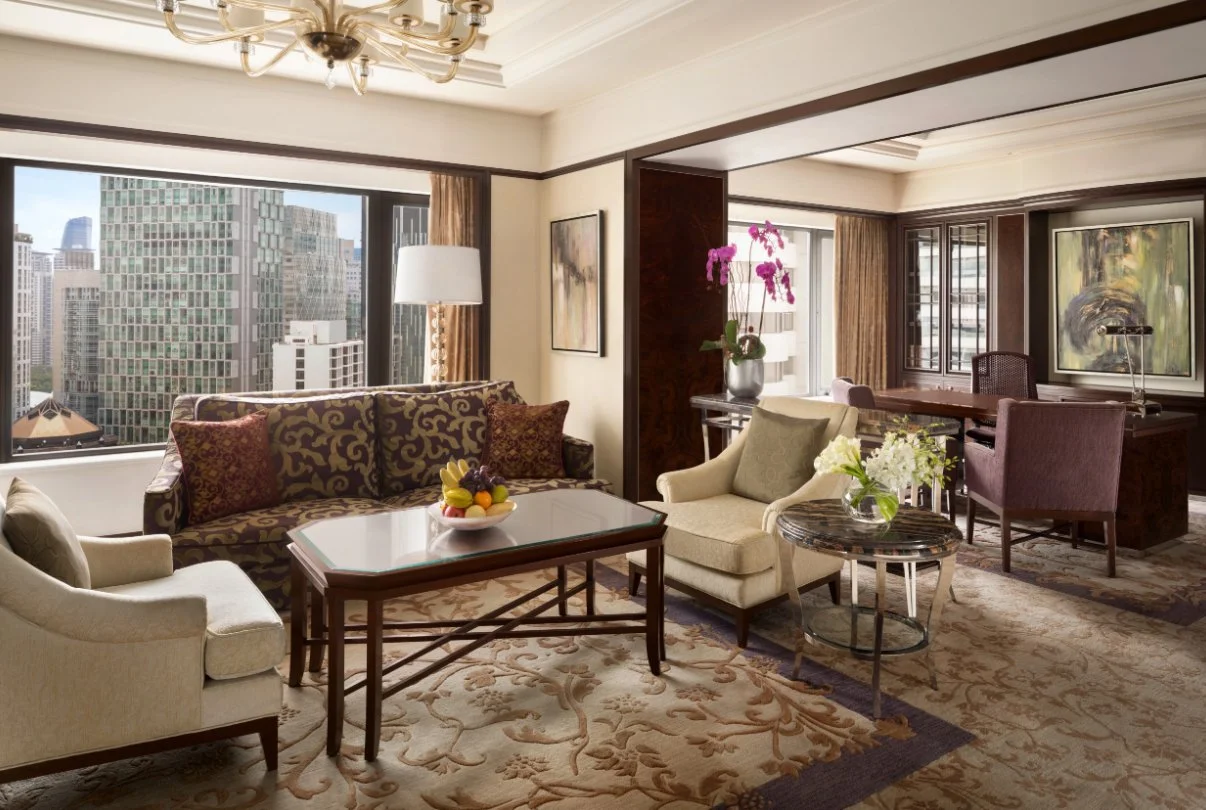
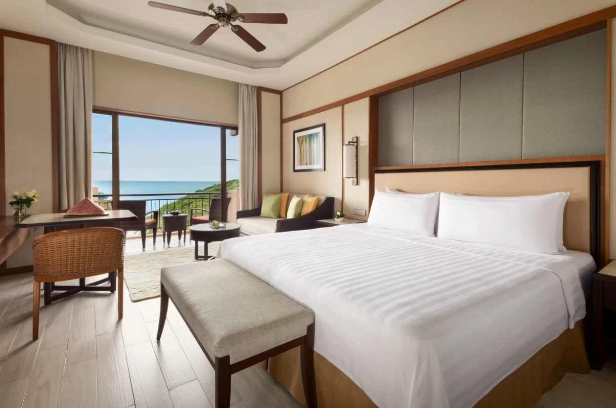
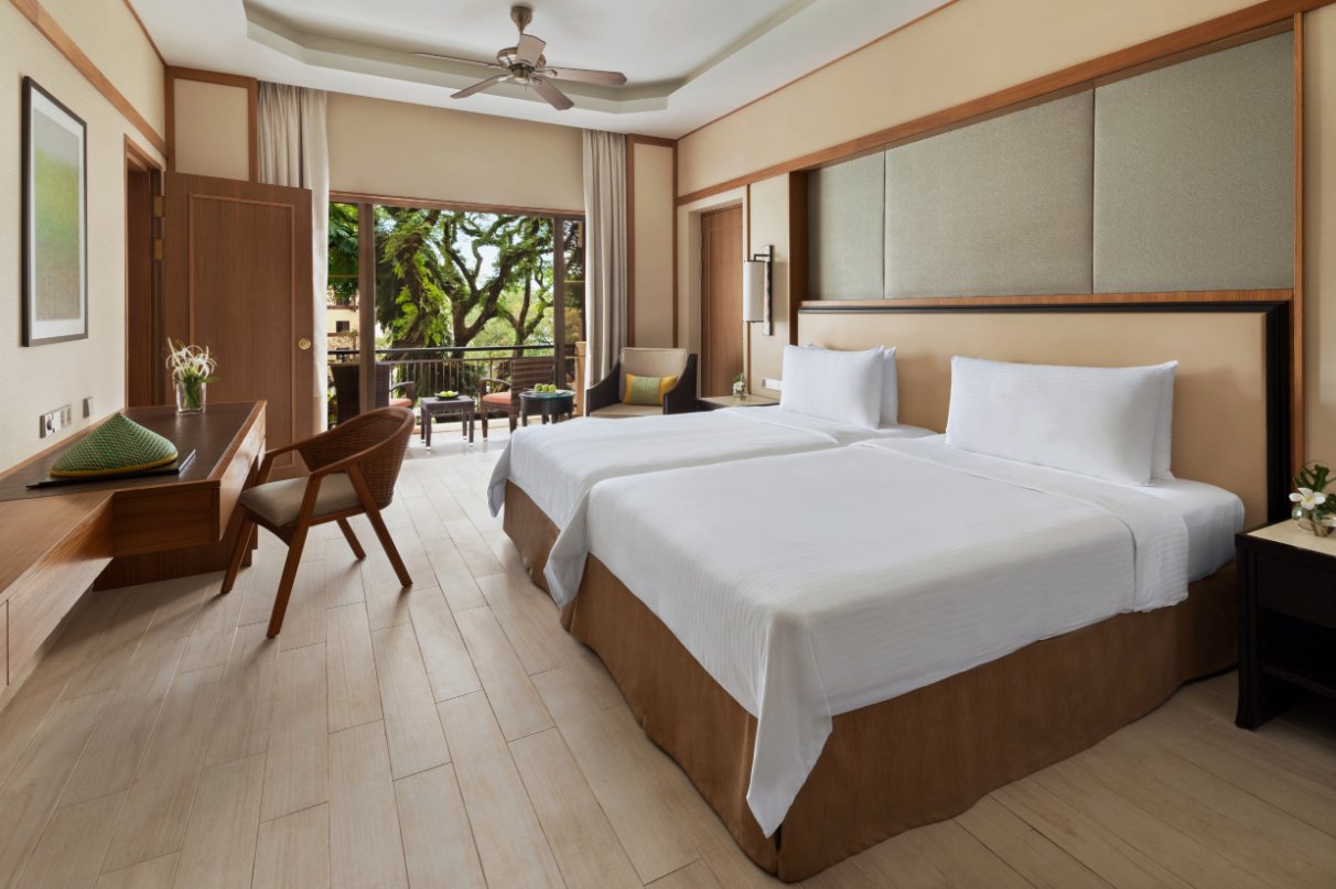
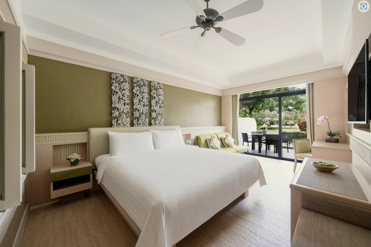
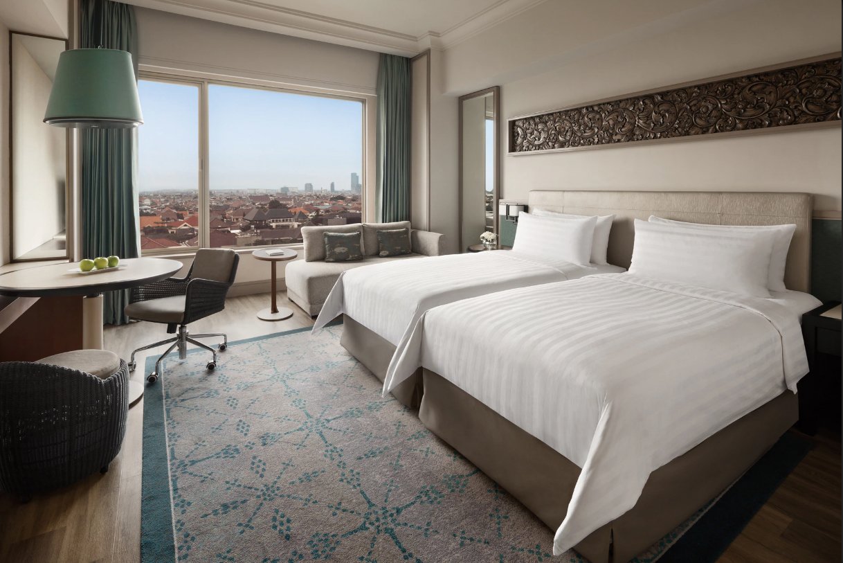
They wanted a more modern, less cluttered, more natural look to their hotel room photographs. They wanted to present their rooms honestly, realistically, in daylight, maintaining their plush high-end luxury look, but without adding the bells and whistles.
VRX Studios worked closely with Shangri-La to develop and test a look that was right for them and then engaged photographers to implement this new look. I was one of those photographers.
An New Look.
Shangri-La Hotels wanted a fresh, modern look without the clutter and an emphasis on location.
Shangi-La Bangkok
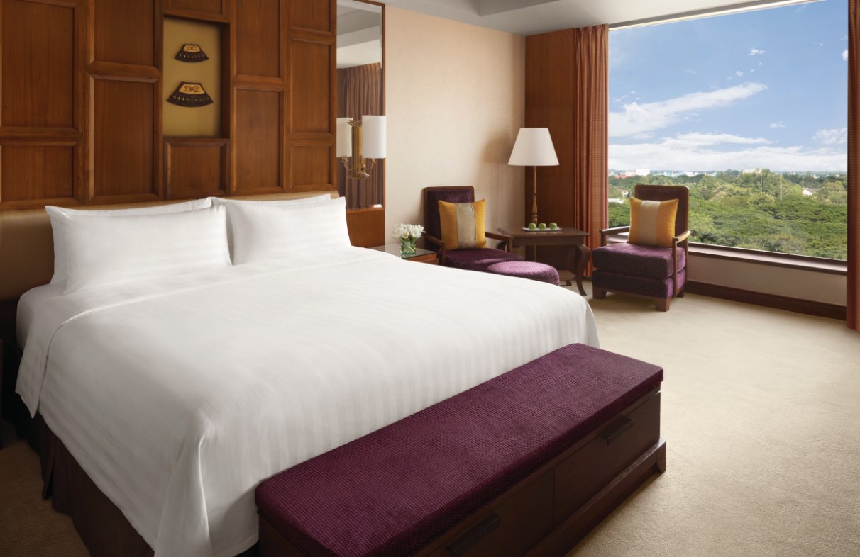
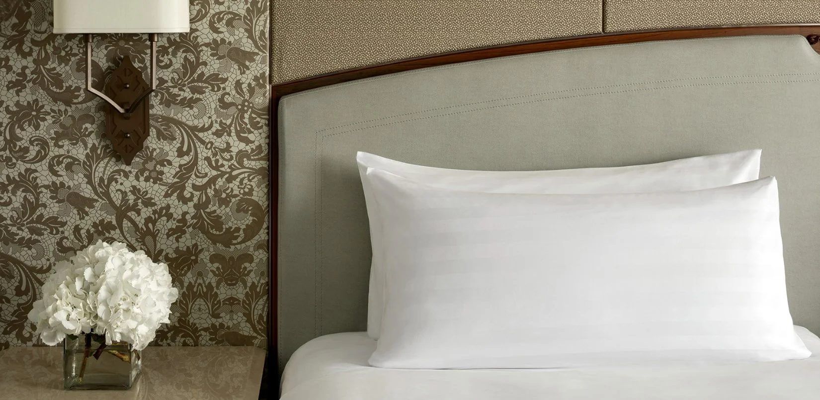
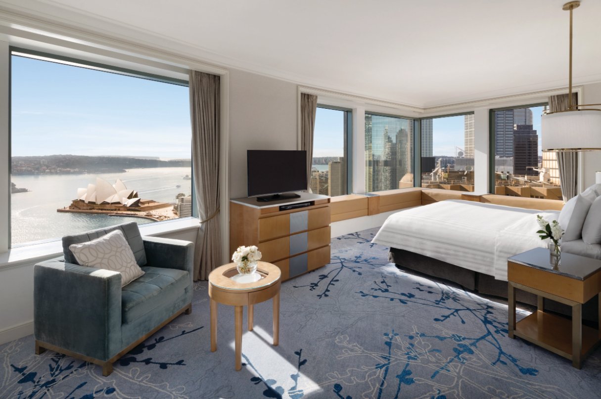
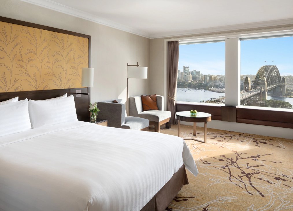
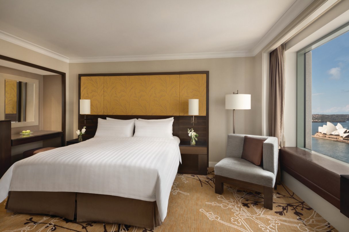
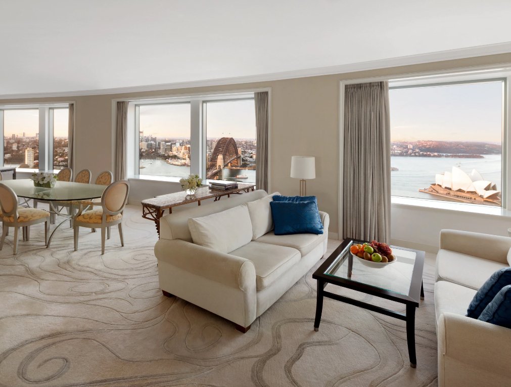
The new look was a departure from the previous visual language that most often showed the rooms at night with high contrast and deep shadows. This new style involved turning all the lights off during the day, minimal and consistent use of flowers and props, and making the rooms appear light and airy. With hotel location being a key point of the group’s message, there was an emphasis on the view.
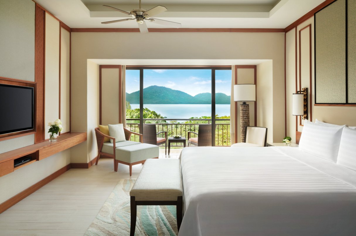
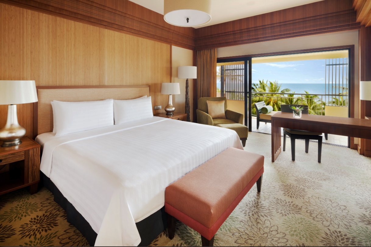
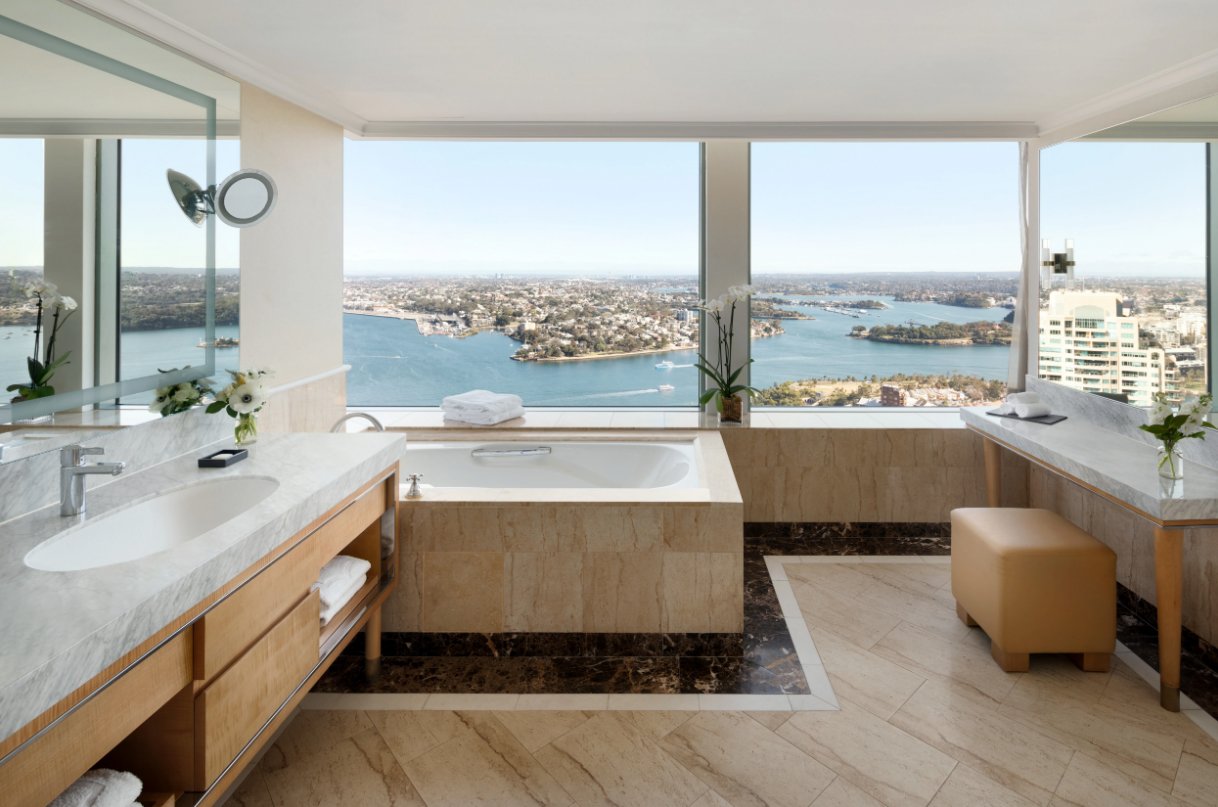
The View
Shangri-La Hotels place significant value on location, so particular attention was given to getting the views just right.
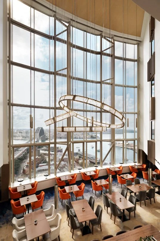
An important element of hotel room photography is storytelling. When I look at a hotel room, I always start by observing the space carefully, checking the angles, and identifying the story that needs to be told. My job is to give prospective guests a taste of the room experience. I need them to feel the fabrics against their feet, sense the natural light pouring in the room, immediately understand the layout of the room, and know that they are making the right choice through just one image. This is done with light, angles, making a bed look lush and welcoming, placing props in just the right place, finding balance in the viewfinder, and fitting stories within stories within the image.
Tell a Story
A room image should contain stories within stories, helping a potential guest picture themselves in the room in one image.
Case study notes: While this is the style the Shangri-La chose for their rooms, it is worth noting that every hotel should be shot according to their vision with their unique visual language. I would work with you on your visual language, ensuring your own unique hotel style.
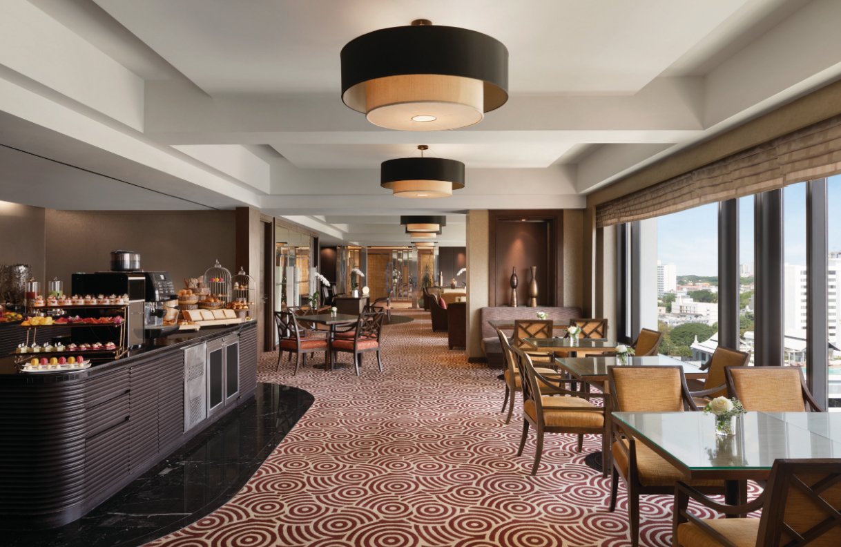
The following images were made by me as they appear on the Shangri-La website:
Credit needs to be given to the VRX team who did all of the post-production on all of the Shangri-La images. By implementing the post-production in one studio VRX were able to maintain consistency and quality control across multiple photographers and continents.


